


Design by Parker Studio, Photo by Jacqui Turk
MAKE ME BLUSH
TRENDS — Words by Annie White
Pink is back, not as a whisper, but as a statement. The only question is whether you’re brave enough to live with it.

Let’s be honest about what pink gets accused of. Sweet. Childish. Girly. Naïve. A colour for bedrooms with fluffy throws and mirrors shaped like hearts. A colour that can’t possibly be serious. And yet pink has always been one of the most strategic choices you can make in an interior, precisely because it triggers a reaction. It provokes. It dares. It tells the truth about taste, desire, and the stories we’re willing to live with.
Through the New Romantic lens, pink is not decoration, it’s theatre. It’s nostalgia with bite, sensuality with intention, softness as rebellion. This is not a “millennial pink 101” refresher. This is pink with purpose, pink as atmosphere, pink that knows exactly what it’s doing.
Design by Miriam Barrio Studio, Photo by Salva López
People don’t have neutral opinions about pink. They have feelings. That’s the point.
Pink comes loaded with cultural baggage and gender coding, plus a whole set of taste politics that tell us what’s “chic” and what’s “too much.” It’s often dismissed as unserious or performative, and in the age of glossy interiors online, it can feel like Instagram bait, a quick hit of colour designed more for the grid than for real life.
Pink isn’t divisive because it’s ugly. Pink is divisive because it’s loaded.

It says something the moment it enters a room, and most of us aren’t sure we want to be caught saying it. New Romantic interiors aren’t interested in apologising for beauty. They reclaim softness, intimacy, and sensual detail as strengths. They insist that comfort can be powerful, and that a room can be both elegant and emotionally expressive.
Here’s the truth most people avoid: we don’t dislike pink, we dislike what we think it says about us. That we’re too romantic. Too expressive. Too much. Pink doesn’t create that fear, it reveals it.
Design by Owl London
There’s a persistent myth that pink “kills the mood.” It’s one of those ideas that gets thrown around as if intimacy can be reduced to a colour chart. But if we’re going to be honest, the mood in a bedroom has far more to do with light, texture, contrast, and how the space makes you feel than whether the walls lean rose or cream.
If pink “ruins” your sex life, the problem isn’t the paint.
What does ruin the mood is flat, candy-toned pink under harsh white lighting. Pink needs warmth. It needs shadow. It needs depth. Dimmable lighting and warm bulbs will do more for your bedroom than any so-called “sexy” palette. Balance a soft pink with deeper notes, oxblood, tobacco, walnut, inky woods, blackened metal, and suddenly it stops reading as sweet and starts reading as seductive. Pink doesn’t kill the mood. Bad lighting does.

We’re tired of post-minimal restraint, the endless beige performance, the careful neutrality that’s meant to signal taste without risking personality. The New Romantic mood is a response to that fatigue. It welcomes emotion back into the room: craft, ornament, colour confidence, sensual materiality. A shift from quiet luxury to felt luxury.
And pink today is not simply ballet slipper or baby blush. It’s pigment. It’s mineral. It’s earth. It’s plaster and clay and velvet and stone with rosy veining. It shows up with complexity, browned at the edges, warmed by terracotta, deepened into mulberry, sharpened into fuchsia. It’s grown up, and it’s not asking to be liked.
Design by Hill House Interiors

Pink works when you stop treating it as a statement and start treating it as a language. The most successful pink rooms aren’t built around “pink” as a theme, they’re built around the emotional effect the designer wants to create: softness, drama, warmth, flirtation, calm, glamour. Here are some of our favourite designers who know how to make pink sing.
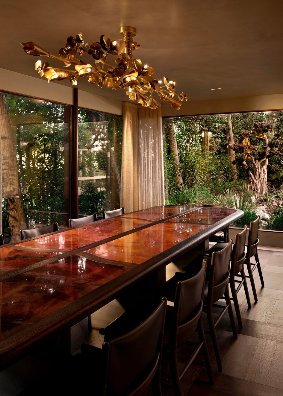
Design by Parker Studio
Photo by Jacqui Turk

Mia Karlsson shows one of the easiest ways to make pink feel confident, not cute, by treating it like a backdrop for stronger moves. The blush-toned stair hall is clean and architectural, with vertical wall texture adding quiet structure so the colour doesn’t turn sugary. Then she disrupts the softness with a punch of contemporary art, all saturated reds and electric blues, plus warm timber balustrades that keep the palette grounded. It works because the pink isn’t asking to be the star, it’s holding the scene together while everything else gets to play.

NJ+ Architects prove that pink can be modern, sculptural, and quietly radical. In Casa Ñe’é, the palette feels mineral, like pigmented clay, and the surfaces do the heavy lifting, textured plaster ceilings, tactile partitions, and a floor pattern that reads like a woven graphic. The pink works because it’s integrated into the architecture rather than applied as decoration. There’s also a calm, sunlit quality to it, which keeps it from feeling theatrical. It’s not “pink room” energy, it’s atmosphere, a space that glows.

In the dining room of Casa Alpaca, Widell + Boschetti let pink do the talking. The plush Arc chairs by Cuff Studio wrap the table in a soft, sculptural rhythm, playful but poised, while Anna Karlin’s Luna Light brings a warm glow that shifts the space from daytime ease to an after-dark, more formal mood. Above it all, the original ceiling, hand-painted to mimic patinated brass, anchors the renovation with a quiet kind of glamour, a reminder that the most memorable blush moments are often layered, not loud.

Parker Studio’s Roseville House is a lesson in using pink as a sophisticated supporting note, not a theme. The kitchen scenes work because the designers mix pink with materials that immediately add credibility: richly veined stone, natural oak, and warm metals. The blush appears in cabinetry and subtle wall colour, then gets sharpened by precise joinery lines and a restrained silhouette. It’s a very adult kind of romance, the softness is there, but it’s controlled, like a well-cut lip rather than a full face of colour.


Photography by Jeanne Canto
MONIOMI, as always, go for maximum personality, and they make the case for pink as a confident, high-fashion gesture. The strength is in the styling: glossy finishes, graphic pattern, and bold contrasts that stop the palette from becoming “pretty.” Their pink lives alongside strong shapes and saturated accents, so it reads as playful but powerful, not delicate. It’s the reminder that if you’re going to choose pink, you can also choose drama.

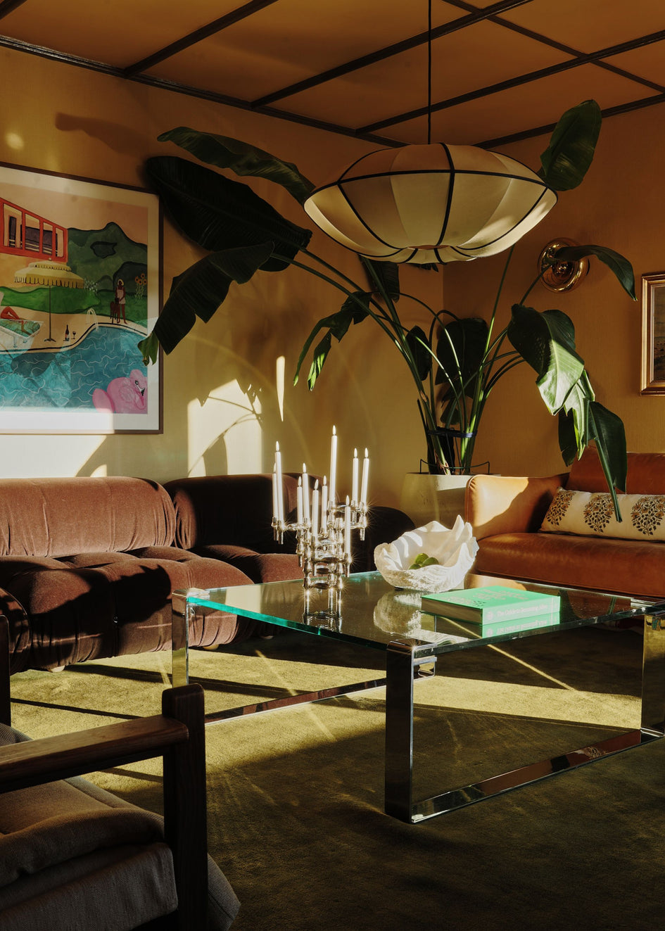
Photography by Salva López
And in the Nora Valencia project designed by Miriam Barrio Studio, pink becomes a kind of softness you feel in the light. The tone is gentle and sun-warmed, paired with natural materials and a calm, considered composition. It works because it’s not fighting for attention. The room lets pink behave like a neutral with a pulse, something that changes across the day and makes everything look slightly better, skin, wood, stone, even the shadows.

Across all of them, the rules are surprisingly consistent: choose a pink with depth, give it texture, and pair it with materials that bring weight, timber, stone, metal, strong art, or clean geometry. Pink looks most convincing when it has something solid to lean on.
Here, pink isn’t confined to a wall. It’s wrapped around thresholds, door reveals, and entire planes, so you experience it as you move through the home. That’s why it feels immersive rather than themed, like walking through a softly tinted atmosphere. The palette leans more rose quartz and mineral blush than “paint-chip pink”, which matters. It reads as stone, plaster, and light, not confection.

What really makes it work is the discipline of the pairings. The blush tones sit against deep, espresso timber joinery and sharp white elements, which gives the scheme a backbone. That dark wood does what black would do in fashion: it edits the sweetness out. The result is romantic, but controlled.
Then there’s the veining and marbling, the pink surfaces aren’t flat, they’re alive with movement. Those stone-like walls and cladding bring natural variation, so the colour feels grounded and grown-up. It also creates a sense of depth in the corridors and portals, where the pink becomes almost cinematic, framing views the way a theatre set does, but in a quiet, modern register.


The layout shots of the dining area underline another smart decision: the designers repeat the pink across different elements (table, wall planes, niches) so it feels intentional, then they introduce contrast through shape and texture rather than more colour. The curved pendant and the shelving read as sculptural punctuation marks, stopping the space from becoming too precious.

And that checkered floor detail is exactly the kind of “expert move” that makes pink feel designed, not styled. Pattern breaks up the sweetness, adds graphic bite, and brings a little Parisian brasserie energy into what could otherwise drift into softness. It’s also a reminder that pink doesn’t need to be the loudest thing in the room, it can be the warmth underneath a sharper composition.

Finally, the bedroom image shows the most underrated trick of all: letting pink behave like a neutral. When it’s paired with taupe bedding, soft daylight, and restrained lines, it stops performing and starts soothing. The romance is there, but it’s the romance of calm, not costume.
Pink isn’t a trend, it’s a temperament.
It asks you to choose an energy, not a shade. To stop decorating for other people’s feeds and start building a room that reflects your own appetite for softness, drama, pleasure, and presence. And if you’re going to choose romance, don’t do it timidly.


